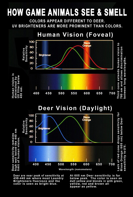
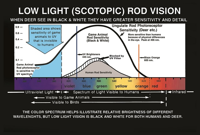
Deer and virtually all land mammals other than marsupials or the majority of primates see a completely different world than people do. This isn’t new information, but here’s a brief summary for those who aren’t familiar with it. Cones and rods are the receptors in the eyes of people and animals. The cones allow for daylight color vision. The rods allow for low light black and white vision. A person’s eye has three types of cones (trichromatic vision), few rods and an ultraviolet light blocking filter. The filter protects it from damage over time, but prevents UV sensitivity, resulting in very poor low light vision. The eye of most animals has two types of cones (dichromatic vision), many rods, and no UV blocking filter. It also has a reflecting layer behind the retina that sends any light passing between the cones and rods back to them. The third type of cone that people have, the “red” cone, allows us to see the longer light wavelengths of our perceptible color spectrum. Without it, deer see yellow, orange, red, pink, brown, tan and some greens as yellow and/or tan/gray shades.
A deer’s nocturnal specialized vision sees ultraviolet wavelengths of light very well, but their color perception is very limited. People see a much more detailed image, but depend on daylight for vision.
*Picture courtesy of Jay Neitz, Ph.D. – Vision Scientist, Medical College of Wisconsin
*(Charts and credit as provided on the ATSKO/SNO-SEAL, Inc. website.)
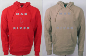
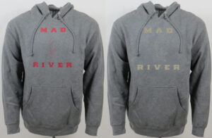
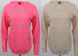
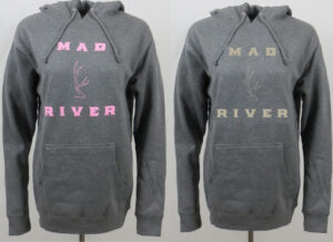
Approximate examples of what deer and most animals are seeing instead of red, pink or orange:
Camouflage clothing for hunting is about reducing your visibility as much as possible of course, but not to a person’s eye, to a deer or other animal’s eye. The gray and the tan/gray in the logo for this webpage isn’t that easy to see. The background photo would appear differently to a deer, but the logo colors would still be just as obscure, if not more so, because of their tone and dullness. The tan/gray is approximately what a deer would see if the buck in the logo were red. Even though red is bright to us, animals can’t see it like we do. A high saturation, vibrant red would be viewed as more of a tan tan/gray, while a less vivid hue would have more of a gray tan/gray appearance. Excellent camouflaging colors either way. Change the tan/gray color to the yellow/tan/gray that a deer would see if the logo buck were orange and it would be more apparent than the tan/gray (unless it had a yellow background) due to the affect of the yellow’s brightness. In daylight conditions, blues, yellows, and white are the bright colors that deer see. Tan/grays, grays, and black are the dull colors. For people, and it would surely be the same for animals, mid-range to lighter shades of tan/grays and grays make up a vague portion of any image. In open or busy surroundings, in lighter or darker settings, either of these flat, dull colors appear as more of a blurry patch/out of focus smudge and almost never define a shape well; as long as they aren’t part of a busy pattern or don’t have a black or extremely dark background while being in a bright setting – which is rarely encountered in the field.
Deer are born with spots. While they are still too young to escape predators their survival mechanism is to lie down and hold perfectly still. The spots effectively aid in their concealment at extreme, as in nearly stepping on them, close range. As soon as they are capable of running well enough to elude danger, they lose their spots. They would keep those spots if there was an advantage to doing so. The camo they have for the rest of their life is a solid appearing, dull colored coat. This is complemented with lighter and darker dull color patches on the face, inside of the ears, throat area, rump, and underside. An open pattern that is very effective at blurring their appearance into any background at any distance (which, really, appears as no ‘pattern’ at all – which, doesn’t contain the high amount of contrasts that are found in busy patterns – which is why, combined with its muffled colors and tones, it doesn’t have to match the busyness of its surroundings to keep from readily defining a form and standing out). Stating the obvious here, but most animals in North America have their own distinct example of the same basic setup. Some with a little more color variation and some with less, some lighter and some darker, but a dull colored coat, in almost always a solid or open pattern arrangement (just as obviously, there are exceptions, but it’s a smaller percentage). Without high power optics (and even with), it can often be difficult for people to spot these animals when they are motionless. It makes sense that this would be even more true for an animal’s ability to spot these animals due to their type of vision that limits color use to help define contrast.
More of the obvious here, but whether predator or prey, it’s vital for most animals to have low visibility to other animals. Many animals have highly visible features that are used for social interaction, but unless they are intentionally being displayed, their coats are adapted to be hard for other animals to see. A solid or open pattern coat, in the range of dull colors that it comes in for the vast majority of North American animals, is a clear indicator of what is the very most difficult for them to spot across the wide variety of backgrounds that it might be viewed in with their type of vision. Also, in the areas I’m familiar with, a deer’s coat has a reddish/tan tone (that would appear to them as a tan/gray) from mid spring to early fall that changes to a gray tone from early fall to mid spring – further indication of the color tone based objects that are hardest for animals to view clearly in the typical background colors they are seeing during those times of year.
A solid or open pattern in colors and tones that appear to most animals as mid-range to lighter indistinct shades of tan/grays or grays has excellent versatility. These colors are found in practically every type of background and their lighter tone and dullness blends obscurely with the bright colors and other dull colors of any shade normally encountered in the field – and in a solid or open pattern rarely stand out . Wearing only browns, tans, and grays while hunting can present a safety concern, and deer see reds and pinks in the same tan/gray shades as the browns and tans – with the added benefit of being highly visible to people.
My interpretations of the technical aspect of precisely what deer see and the exact reasons that explain the effectiveness of solid or open pattern red and/or gray clothing might be off a little, but the end result is not. The color comparison photos shown earlier depict an estimate of what deer and most animals see. From hiking/backpacking, to wildlife photography, to close range bowhunting, to softening an orange vest’s brightness, the excellent low visibility effectiveness of solid or open pattern red and/or gray clothing is not an estimate – it works.
I’ve had a few ultra close encounters where the pictured shirt’s ability to avoid detection has been pretty much uncanny, but across all distances and early season backgrounds it has consistently proven many times over that the deer and elk just don’t see it well. It has been just as effective as a busy pattern when in busy surroundings, while remaining extremely effective out in open country or in open spaces in mixed cover country, where it isn’t prone to turning into a well defined form – like anything with a busy pattern commonly does.
*Animals can’t see green. Basic greens are seen in the same dull tan/gray color as the reds, pinks, browns, and tans. Any other hue of green that is made up of even slightly more blue than yellow or yellow than blue, no matter how soft of a tone it has, will be viewed as a brighter tinted blue/tan/gray or yellow/tan/gray. Color variants of the reds, pinks, browns, and tans will have different shades, but are still viewed as a tan/gray – without the chance of having a bright tint. Meaning, if you wear red, pink, brown, or tan clothing in green surroundings, it will be viewed by deer as a shade of a dull color that is a match for the base green in those surroundings – just like they are in the warm season.
What the best camo through an animal’s eye might look like:
Reds, pinks, browns, tans, basic greens, and grays will be the standard for apparel and gear offered on the outdoor sportsman/sportswoman page. Mid-range to lighter shades of these colors, either solid or in an open pattern design, provide low contrast and low definition to an animal’s dichromatic vision and appear as more of an inconspicuous, harder to focus on blur in any natural background – while offering the same type of versatile camo that their coats do.
*Most fabric dyes contain UV enhancers that reflect UV light and make colors appear brighter. Most laundry detergents contain UV enhancers to keep colors looking bright. Most animals have vision that is very sensitive to UV light. This is well known information, but the importance of laundering clothing in no-UV detergent before using it for hunting is probably underrated. Regardless of color, shade, or pattern, clothing that reflects UV light appears bright and has much higher visibility to the eyesight of deer, elk, ect. in low light conditions.
Comfort performance that works exceptionally well as camouflaging if you use it for hunting. All of the clothing available on the Outdoor Sportsman/Sportswoman page will be made up of colors and color combinations that provide low visibility to most animals.